MOST TRENDY COLOURS FOR HOME DECOR IN 2018
At the end of the previous year, colour companies announced their colours for 2018. Luckily each year we are presented with both darker, deeper tones as well as lighter, subtle colours, so that there will be something to choose for everyone. If you’re looking for ideas, then try to look at the stunning colours below to get inspired to make your next move in transforming your home décor.

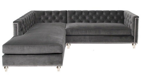
Black Flame, Black Magic, Deep Onyx
Looks like black is coming back! PPG Paints and two of its brands, Olympic and Glidden, gave special attention to shades of black for 2018. They opted for black/grey/navy mixture and their colours are just stunning. PPG Paints Black Flame features tone similar to indigo. “Black Flame acts like a black curtain, allowing your other décor elements to take centre stage,” says PPG. “It’s a fantastic blend of black and navy, two classic hues. Black creates the silence we crave in an information-heavy world, while the navy offers possibility and a deep hopefulness.” Olympic’s Black Magic is bold and sophisticated, perfect for making a statement, while Glidden offers up a direct, streamlined black in Deep Onyx. Dark, rich accent colours on our walls, cabinetry and furniture complimented with light neutrals is what I think we’ll be seeing more of in 2018 and beyond. Whether you boldly add it all over or you reserve it for a select few accents, it’s sure to give your space an ultra-cool facelift heading into the new year. From a minimal room to a retro space this classy colour can work its way in any interior bringing a modern vibe.


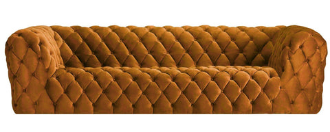
Caliente
Benjamin Moore opted for a bold, infused colour that has a lot of vibrant energy. Caliente is eye-catching shade, ideal for a feature wall or piece of furniture such as an accent chair or an ottoman. "Caliente is the signature colour of a modern architectural masterpiece; a lush carpet rolled out for a grand arrival; the assured backdrop for a book-lined library; a powerful first impression on a glossy front door. The eye can’t help but follow its bold strokes. Harness the vitality” says Benjamin Moore.


Sandstone
For those who favour neutrals, Sandstone Tint from Dutch Boy is a subtle but rich shade. According to the company, it's "a hue that nods to the simplicity of the past, while also making a modern, colour-confident statement that looks to the future." It’s sophisticated, calming as well as easy to decorate with and surely will find many enthusiasts.


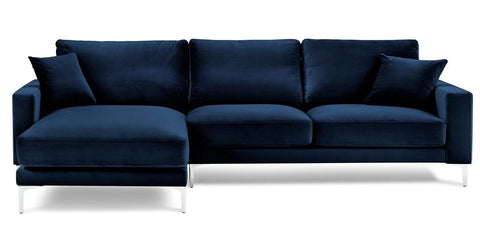
Ultra Violet
Pantone Colour Institute has published Ultra Violet as 2018 colour of the year. Their experts have arrived to the conclusion based on their deep-dive analysis and research on wide array of topics from fashion, art, technology, interior design, to entertainment such as music, film, sport, and travel. But as Laurie Pressman, Vice President of the Pantone Colour Institute said- “The Pantone Colour of the Year has come to mean so much more than ‘what’s trending’ in the world of design; it’s truly a reflection of what’s needed in our world today.” As a colour, purple combines the calming stability of blue and the fiery energy of red. It is considered a royal colour and symbolizes luxury and extravagance.


In the Moment
Behr choice of 2018 is a blend of blue, grey and green. "In the Moment speaks to our society's desire to disconnect and be present," said Erika Woelfel, vice president of colour and creative services at Behr. "It crosses multiple design styles — global, coastal, modern — and pairs well with other subdued colours to create harmony for interiors or exteriors."


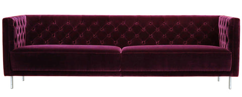
Heart Wood
Dulux pick of the year Heart Wood is a blush pink in a dusky hue with a touch of lavender undertone. This colour provides a beautiful element to the feature wall in a primarily neutral room and is also stunning on furniture, such as sofas and accent chairs.


Oceanside
Choice of colour of 2018 by Sherwin-Williams. According to current trends, now is the time to take colour risks and this deep and moody shade can certainly deliver. This “collision of rich blue with jewel-toned green,” is a colour that is both accessible and elusive, says Sherwin-Williams. “A complex, deep colour that offers a sense of the familiar with a hint of the unknown, Oceanside, bridges together a harmonious balance of blues and greens that can be found in what's old and new.”


Images via Pinterest
Whether they are soft and calming or bold and invigorating, the range of colours for 2018 are sure to find a fit in your home.