THE TOP COLOUR TRENDS OF 2019 IN INTERIOR DESIGN AND FURNITURE

Unlike last year, the 2019 will be more mindful with regards to the colour choices. As 2018 was mostly about black, strong reds and violets, this year will be more about lifestyle-based dictated shades. We are going to see terracottas, greens, aquas as well as grey-beige tones.
If you are looking for new house décor or you would like to be inspired by new hues, check out new trends suggested by top paint brands, including Sherwin Williams, Pantone, Benjamin Moore and many more…
Below we are presenting the ideas for interior design which implements new colour scheme and our series of furniture inspired by current trends.

“Metropolitan AF-690 emanates nuance, harmony and extravagant ease. Always adaptable, it softens to matte or shimmers with sheen. It's neutral. It's composed. It just is. This is colour, off-duty.”
-Ellen O'Neill, Benjamin Moore & Co.


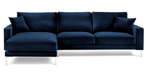
"An honest, approachable colour that conjures up the blueprints builders rely on to bring architectural designs to life, Blueprint creates a space where you can build your own reimagined life—where -awareness of what we want to build for ourselves can transform into action."
-Behr


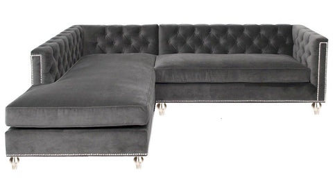
"Experience the transformative power of paint with PPG’s 2019 Colour Trends. Our 2019 Colour of the Year – Night Watch (PPG1145-7) – is a rich, luxurious, and classic shade of green allowing spaces to emulate the feeling of lush greenery and the healing power of nature. Night Watch’s versatility allows the paint colour to be used in a variety of rooms and design segments – from healthcare to commercial and residential design."
-PPG paints
“The restorative power of nature is important in society now more than ever,” explains Dee Schlotter, PPG senior colour marketing manager. “Night Watch is about bringing the healing power from the outdoors into your home through colour. The dark green hue pulls our memories of natural environments to the surface to recreate the calming, invigorating euphoria we feel when in nature.”


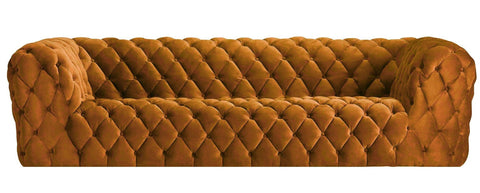
“A warm terracotta colour with ancient, elemental roots, Cavern Clay is our 2019 Colour of the Year. Cavern Clay is a nod to mid-century modern style, but with the soul of the American Southwest, which together creates a desert modern aesthetic.
This warm, earthy hue is both casual and refined. It can be the backdrop of a playful, welcoming dining room or kitchen when paired with bright tiles, warm stone and sculptural greenery. Complementary materials include leather, simple woodgrains and indigenous cacti in contemporary, sleek gardening planters.
Cavern Clay is an easy way to bring the warmth of the outdoors in. Envision beaches, canyons and deserts, and sun-washed late summer afternoons—all of this embodied in one colour.”
-Sherwin-Williams


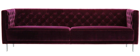
“PANTONE 16-1546 Living Coral emits the desired, familiar, and energizing aspects of colour found in nature. In its glorious, yet unfortunately more elusive, display beneath the sea, this vivifying and effervescent colour mesmerizes the eye and mind. Lying at the centre of our naturally vivid and chromatic ecosystem, PANTONE Living Coral is evocative of how coral reefs provide shelter to a diverse kaleidoscope of colour.”
- Pantone


“This rosy neutral injects an element of spirituality into everyday life.”
- Sue Kim, Valspar Color Strategist
“With a little attention, we are able to turn our daily rituals into a nourishing spiritual practice. This light, lovely neutral encourages us to set our intentions for a more optimistic day.”
- Valspar


“Spice of Life is an outgoing, confident hue that adds drama and stimulates the senses,” explained Sara McLean, colour expert and stylist for Dunn-Edwards. “It’s a celebration of what makes life interesting and exciting. Spice of Life makes a bold statement with a melding of diverse and global cultural influences.”


“Spiced Honey is a warm amber tone, inspired by the beauty and versatility of honey itself. Spiced Honey can be soothing or calming, cosy or vibrant, depending on the palette you pair it with.”
-Dulux


Images via Pinterest